My spidey sense is tingling. And I just can’t shake it.
On FOMC Wednesday a few weeks ago, the market basically did exactly what I thought it would (and laid out here) – a “hawkish” 50bps cut by JPow that saw a spike high in gold and equities, and then a strong pullback into the close. Once the equity market closed, global FOMO forces took over and propelled equities and gold higher at the expense of the USD.
“JPow is cutting aggressively to promote a soft landing, money is going to be cheaper, Buy Mortimor Buy!”

~2 weeks ago, China decided to go full on monetary (but not fiscal) stimulus and the FOMO crowd went absolutely bananas in Chinese equities. At one point, FXI was up ~30% in 9 trading sessions! But earlier last week, they elected to refrain from fiscal stimulus and the air was let out of the balloon, as the Hang Seng Index dropped 10% in one session. Stability at its finest.
Last Friday’s monthly jobs report, as great as it appeared, was entirely driven by a historically inexplicable gain in government jobs and presumably forces the FOMC to be less aggressive cutting monetary policy than before. Not surprisingly, we saw a massive USD rally and corresponding selloff in USTs, One would have thought equities would have pulled back, since an aggressively easing FOMC was main reason for the initial move higher in risk assets. Naturally, we closed the week at a weekly all-time high, even with the “headline” VIX in the 20s (though that’s very much distorted because the calculated/reported VIX carries past the election).
This week saw very little in the way of economic data except a CPI report that came out slightly worse than expectations and prompted more Fed officials to suggest fewer cuts and/or potential pauses in cuts… and we’re closing again at weekly all-time highs. FOMO is very strong.
Here’s a laundry list of reasons to be significantly conflicted:
- Germany revised guidance for GDP growth for all of 2024 to a negative 0.2% earlier this week. Germany, mind you, is one of the world’s largest and most efficient industrial economies with significant export exposure to China, and despite an aggressively easing ECB, Germany’s GDP is going to shrink in 2024.
- Iran lobbed its largest ever missile attack at Israel, causing oil to spike $10+ in a week, and we know Israel’s response is imminent. Is it a “proportionate” response like earlier in the year where everything settles down again? What if if they go after Iran’s nuclear and/or oil sites?
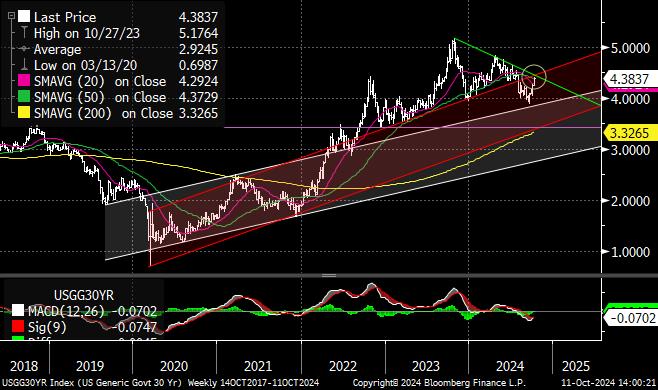
- After the jobs and CPI reports, the 30yr UST ran straight to an enormous inflection point ~4.40%. How it trades the rest of the month will be very important.
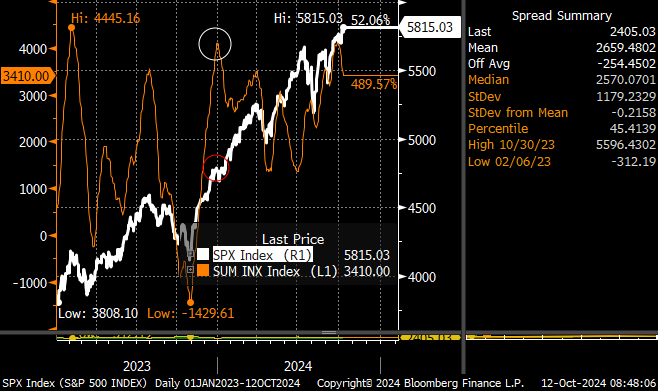
- Breadth, as measured by the McClellan Summation Index, is strong and what you’d expect to see in trending bull markets. It did roll over this week, a pattern that is usually indicative of short-term topping. The Oscillator, on the other hand, is more indicative of a short-term bottom.
- While we’re at/near new all-time highs in the Dow Jones Industrials, S&P 500, and safety sectors like utilities and consumer staples, it is quite noteworthy that many sectors are not… also notable that many leaders/bell weathers (ahem, SOXX RTY BKX please stand up) are nowhere close to all-time highs. Can you have a sustainable bull market if semiconductors, banks, and small caps are nowhere close to confirming highs elsewhere?
- AAII Bearish Sentiment is back to the ~20% level that often marks short-term bullish euphoria. It’s not a signal to trade off of, per se, but it is one of those “if everyone is already in the pool, who’s left to get in?” contrarian indicators.
Other various thoughts and observations…
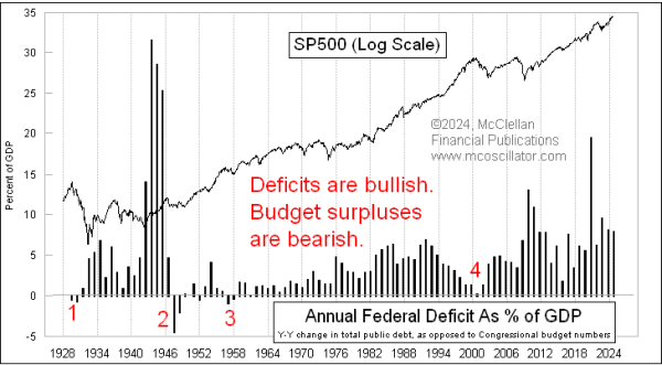
Tom McLellan did an analysis of government deficits (see here) over the past handful of decades and came to a logical conclusion – massive current account deficits are horrible for the future, but they aren’t bearish while they’re happening. Many of the summation and breadth stats suggest we are likely not at a point where it is appropriate to be longer-term bearish. As I have said for a while now, as long as the US government is running fiscal deficits to the degree with which we/they are, it’s hard to have a recession and be materially bearish of risk assets.
But as you see in McLlellan’s main chart, the current degree of reckless annual fiscal spending has only been eclipsed three times in our history – World War II, the aftermath of the 2008/2009 crash, and the immediate response to COVID. What’s the rationale now? Obviously nothing, it’s just that our populace and government have become addicted to spending, believe there are no consequences to such actions, and have no tolerance for any form of discipline or even austerity. Even if we wanted to reign in our spending, the math now suggests it’s virtually impossible to do so. Bullish until it’s not?
Last summer/fall, when the bond market was historically unstable, there was quite a bit of chatter around “fiscal dominance,” which insinuates that monetary policy is largely toothless when fiscal policy overwhelmingly dictates economic conditions, which can happen during both stimulatory (e.g. now in the USA) and contractionary environments (e.g. Greek austerity ~10 years ago). If I look around at the market and economic landscape now, it seems impossible to refute this:
- Interest rates in the US are dramatically higher relative to every other developed nation, and our pace of easing is significantly behind other nations.
- Our GDP growth is, and has been, materially faster and more resilient than every other developed nation since COVID.
- Inflation has been far worse in the US than anywhere else since COVID, despite comparatively restrictive monetary policy.
In many ways, the current period in history is beyond unprecedented. Our government is spending money we do not have and issuing debt in such a way that we as a nation cannot remotely “earn” our way out of. And yet, because the current global monetary regime is predominantly USD based, we have been largely able to get away with it, and there’s no reason to believe that will not continue in the relative near-term. That does not mean the underlying economic and societal tensions behind the “fiscal dominance” policies do not exist; they are quite real and eventually will be very disruptive, even if the market chooses not to see them at the moment.
The development, acceptance, and now widespread utilization of 0DTE options has created an almost lottery type feel to the US equities markets, somewhat akin to 1999-2000 NASDAQ but of a more leveraged and dangerous variety. When liquidity is pervasive and call options are dictating sentiment, everything looks and feels great, like it does now. Something will happen eventually and that switch will flip, and no, we have not seen that yet (the August mini-crash was predominantly FX and volatility driven, the 0DTE crowd didn’t have time to participate in that move to the downside).
I’m not saying it will happen soon, but at this moment in time, investor positioning is such that a fear-driven move downward would likely be exacerbated… materially.
In some ways I’m wired to be a tin foil hat guy. I understand and wholeheartedly endorse optimism and hope and a favorable view of the world, and I do try to personify that in my everyday life. But the complacency I see in many places currently seems… misaligned. At least until Iran/Israel stop trading missiles and we know who’s running the country for the next 4 years. Little stuff.
On to the charts…
30 year UST rates did a funny thing on their way to my 3.50% target: they decided the fiscal deficit and economic growth were too strong to push to 3.50%. Hence the almost straight line pullback from <4% to this enormous inflection point at ~4.40%. By all accounts, the bond market selloff should stop here and at least stabilize for a little while. I still have my eye on the base of that red channel that hasn’t been tested in nearly 3 years, though…
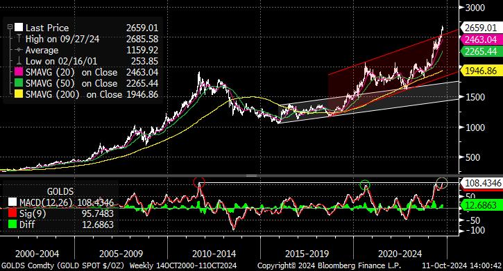
Gold is doing what it usually does in times of both monetary excesses and global strife – it goes up. I vividly remember being on the trading floor as QE was growing from 2010-2012 and watching gold go up seemingly every single day; in many ways, it’s the same dynamic here. What is a little harder to notice is that gold’s weekly MACD reading is the highest in history, exactly in line with the top in 2012. The fundamental reasons for gold have been clear for a while now, but it is also very well owned at the moment.
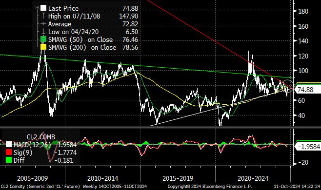
Oil has been range bound for the better part of 2 years and still can’t make up its mind what it wants to do. That economic growth headfake into the mid $60s last month was quickly dismissed, but without bombs and missiles flying in the Middle East, it can’t sustain trade in the $80s. Global economic growth isn’t good enough to trade higher, but US fiscal printing and geopolitical fears mean we can’t trade much lower. So back we are in the mid $70s, waiting for another catalyst to take us somewhere. But my goodness does this chart look coiled… and when it breaks this pattern, it can’t be to the downside, can it?
Here are the two McClellan charts I referenced above…
- Summation rolling over is usually indicative of short-term topping. In the past two years, every time summation exceeded a reading of 3500 (left y-axis, top chart), it marked a short-term top, with the exception of January 2024 and now.
- Meanwhile, the S&P 500 made new ATHs seemingly every day this week while the Oscillator stayed below zero. I’m sure that’s happened before, but it sure seems counterintuitive.
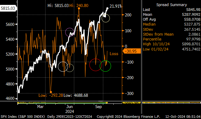
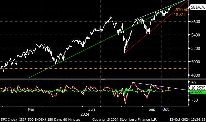
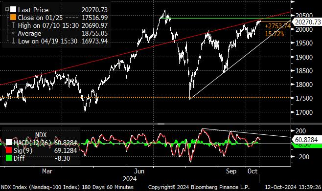
I’ve seen a few talking heads recently discussing the “break out” in equities, and I candidly don’t see it. If anything, both the S&P 500 and NASDAQ are supporting significant negative divergences on many time frames (60 minute charts are below) far more associated with tops. Barring any exogenous shocks this week, it does seem like investors want to keep pushing this higher, but the air is getting thin up here.
